Project Background
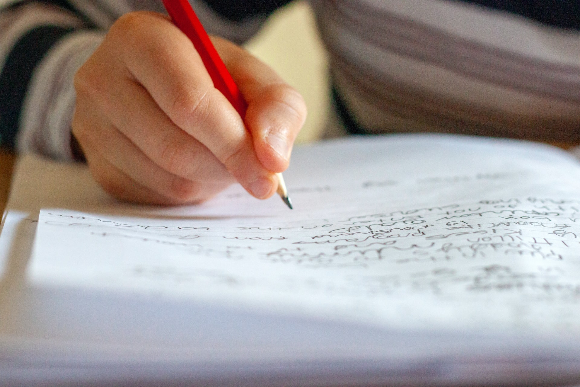
Oriel Square recently worked with HarperCollins to produce a handwriting course for primary school-aged children. The aim is to help children learn to write with speed and fluency, in order to direct their energy towards the content of their writing, rather than the process of getting words on a page.
Oriel Square was responsible for creating a unique handwriting font for the course.
As well as developing design aspects and carrying out all editorial stages of the project, Oriel Square was responsible for creating a unique handwriting font. The creation of the Collins Handwriting font was a vital step in facilitating the aims of the handwriting programme. This font demonstrates the most natural and efficient letter formation techniques, enabling children to build fluency in their writing.
Our approach
Our Design Lead, Rebekkah Hughes, managed the font creation process. She worked with Collins to finalise the brief and commissioned a typographer to produce the unique font, working alongside Collins’ handwriting expert to ensure that the needs of learners were met.
We took an iterative approach to the project by producing the individual letters, reviewing them and then making small tweaks until we achieved a finalised font.
We took an iterative approach to the project by producing the individual letters, reviewing them and then making small tweaks until we achieved a finalised font that modelled practical, consistent and efficient handwriting. We first created a Roman printed version, designed to teach younger learners basic letter formation, in order to prepare them for joined-up writing at a later stage. We then created printed and joined cursive versions, which naturally follow from the Roman font, for older learners to use, as they begin to practise their joins.
The final fonts also accommodated dyslexic learners; we varied the shapes of problem letters, such as p, q, b and d, to help avoid common confusions.
What we delivered
The fonts were used prominently in the Happy Handwriting course.
The fonts were used prominently in the Happy Handwriting course, throughout Teacher Guides, Practice Books and class-facing presentations. Teachers can also use the fonts to create their own worksheets, in order to help them maintain consistency in their lessons.
Why work with us
- We have strong in-house design capabilities and can source further experts to ensure we bring the best skills and knowledge to your project.
- We can take on a project with both design and editorial demands and can ensure that these two aspects are combined for a cohesive and successful final product.
- We can work for you on content in any subject, for any age group from reception to A Level.

